
Are you having trouble sizing your images for your blogs? I have been there before.
And it usually happens with the featured image. Since we’re talking about images, let’s be visual. Here is an example of a cover photo on a WordPress blog:
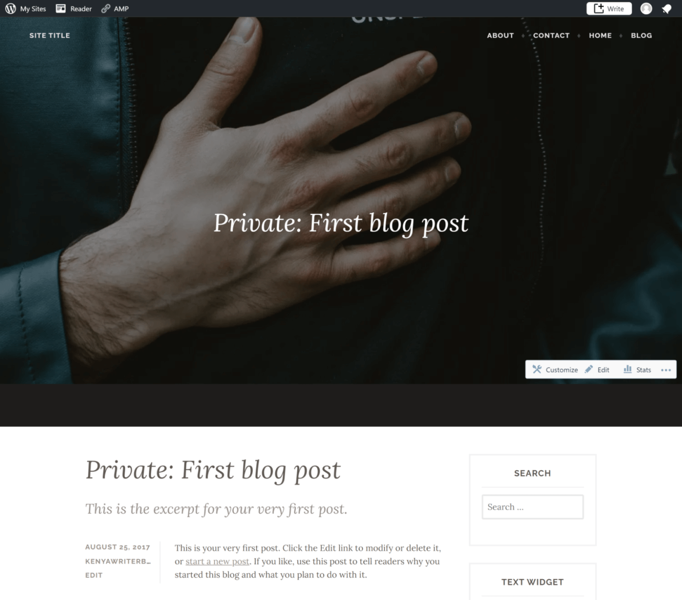 Here is the actual photo:
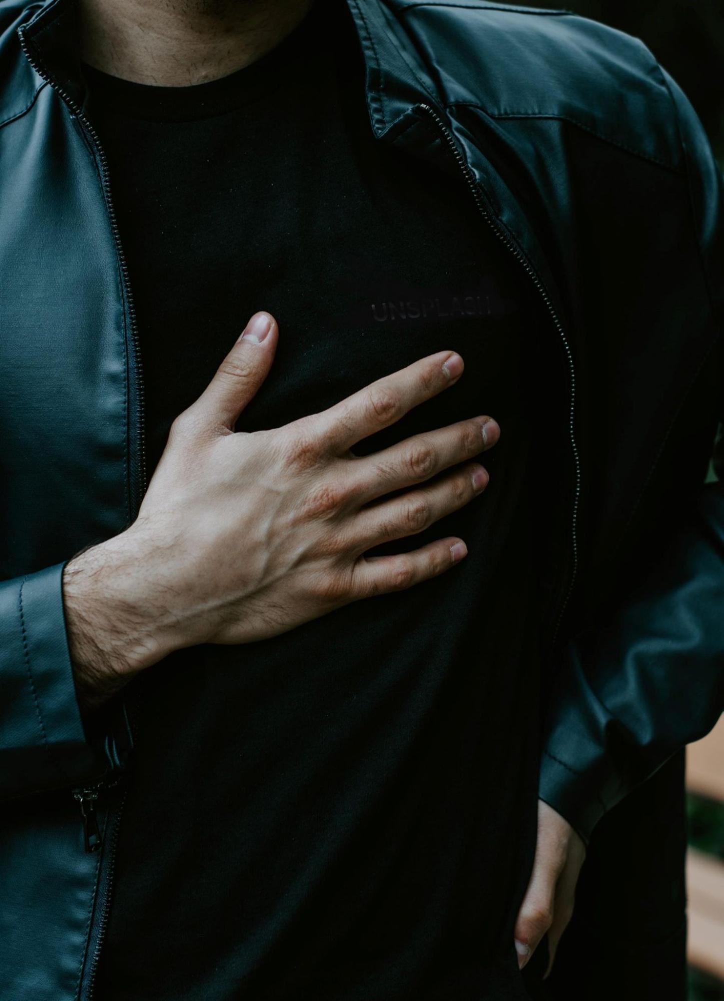
Because of the limited viewing height, you don’t see the rest of the image.
The mistake here is trying to use a portrait image as the featured image. That’s because the featured image container allows for a landscape image – where the width is longer than the height.
In this article, we’ll be tackling commonly asked questions about image sizes such as:
- What size should my blog images be?
- What are the standard image sizes?
- What’s more important: image size or aspect ratio?
- How do I make a retina-ready image?
- How do I resize an image without losing quality?
- What are the best apps for resizing images?
- What is the best size for a featured image in WordPress?
- How do I automatically resize and compress images in WordPress?
- What is the perfect file size for images?
Feel free to skip to the question that you are having trouble with. And if you have a bit of time, go through the whole thing. There is a lot to learn!
What Size Should My Blog Images Be?
It depends on the design of your blog posts. No matter how many images you include in your blog, all your images will be inside the content column. For instance, if your content column has a width of 800 px, you should use an image with the same width (800 px) to cover the available space sufficiently.
“I don’t know my content width?” No problem, it’s easy to figure it out.
You just have to use Developer tools. If you’re on Google Chrome, open any blog post that you have published. Sample posts are okay if your blog is brand new.
Maximize the browser window, right-click anywhere on the page, and choose inspect from the right-click menu.
Click on the Box With an Arrow symbol from the top left corner of developer tools to toggle on the inspect element function.
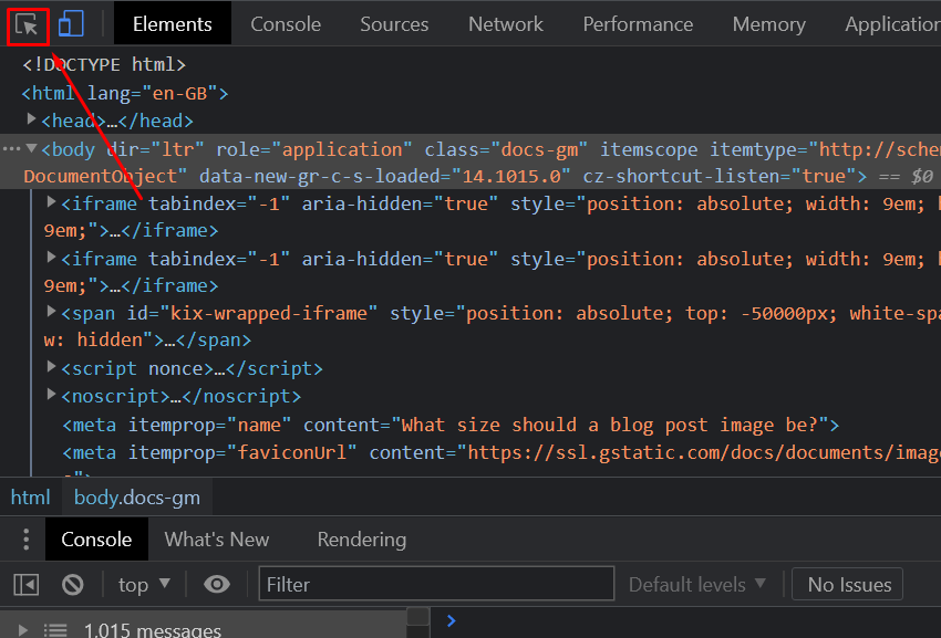
Just hover your mouse over the page to check the dimensions of various elements. For in-post images, find out the width of the paragraphs.
Note that paragraphs and image containers may have different dimensions for some themes.
In this example, the content width is about 845 px. Our images can range from 640 px to 840 px and will snuggly fit into the available space.
Note that the content column width is dynamic. It changes based on the screen size.
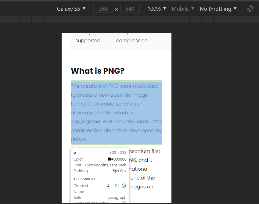
For instance, now we have a 300 px column width, and we’re viewing the same page using a simulated smartphone Galaxy 5 screen.
Don’t worry about uploading smaller photos to cater to different screen sizes. Your blog will likely have automatic scaling.
Boiling it down, for images you intend to use inside blog posts, just keep the dimensions within 80-100% of the available content column width.
What Are the Standard Image Sizes?
There are no set standard sizes for blog images. It all boils down to the blog design. Still, there are some commonly used dimensions:
| Width | Height | Comments | |
| Featured images | 1200 | 628 | Will work with most WordPress themes |
| Author image | 500 | 500 | Face at the center |
| Facebook preview image | 1200 | 628 | – |
| Twitter post preview | 1024 | 512 | – |
| In-post images | 600 – 800 | Varies | – |
| Thumbnail images | 150 | 150 px | – |
| Screenshots | 600 – 1280 | Varies | Try to match the available content width |
| Full-width images | Up to 2560 px | Varies | To cater to wide screens |
| Infographics | 600 – 1100 | Up to 2000 |
What’s More Important: Image Size or Aspect Ratio?
I’d argue that if you’re after consistency, you should consider the aspect ratio of your photographs rather than the image dimensions.
The aspect ratio is the relationship between the width and height of the image. Some popular aspect ratios include:
- 4:3 – Utilized for monitors, TV screens, smartphone cameras, and online photos.
- 3:2 – Widely used for print and professional photography with DSLRs and film cameras.
- 4:5 – Ideal choice for portrait photos.
- 1:1 – Prominently used on Instagram for main feed photos.
- 16:9 – Ideal choice for landscapes.
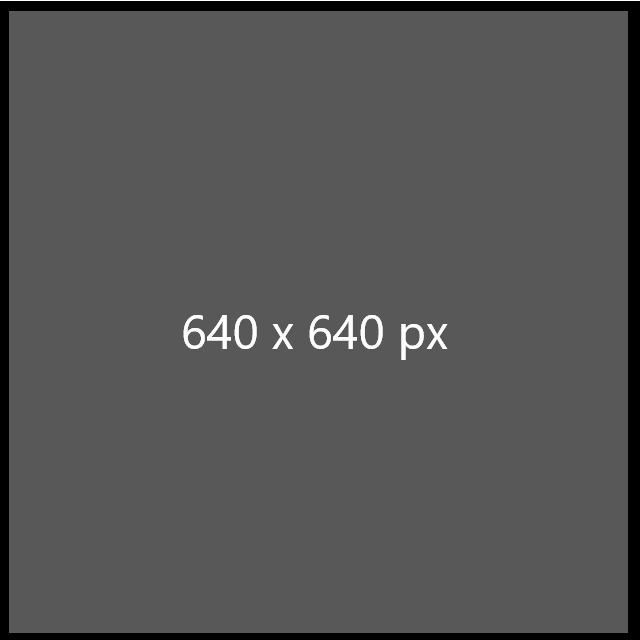
Now, let’s do a quick exercise. Here is a landscape photo with an image size of 1920 x 1080. Its aspect ratio is 16:9
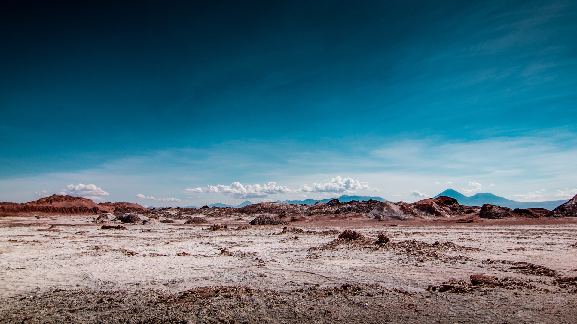
The next image is 640 x 360 px. By using the same aspect ratio, the images appear consistent.
Thirdly, we have an image with an aspect ratio of 1:1. Right away, you can notice the inconsistency.
So, follow a constant aspect ratio for your blog images. But it doesn’t have to be one. Have up to 3 ratios to accommodate for different uses.
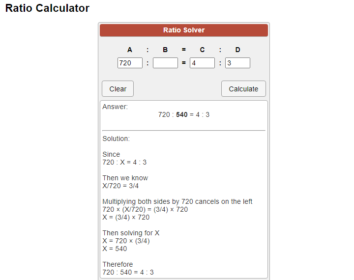
As you resize images or take screenshots, you’ll need a ratio calculator to determine the image sizes from the aspect ratio.
I love the following free ratio calculator from Calculatorsoup.com. All you need to know is the dimensions of one side.
How Do I Make a Retina-Ready Image?
Superior quality screens typically have a higher pixel density than normal monitors. For instance, you have probably heard of 4K monitors, retina displays, IPS LCD, or OLED displays. Because everything is sharper, standard images can appear blurry.
You can make your images retina-ready by uploading images that are two times larger than your content column width. So if your blog has a post-column width of 800 px, images should ideally have a minimum width of 1600px.
How Do I Resize an Image Without Losing Quality?
If you’re cropping an image, there will be no loss in quality. You’ll only remove the unwanted parts, ending up with a smaller image.
Sometimes, it’s not possible to crop an image. You have to resize it. During the resizing process, the software has to remove information from the image. Inevitably, there will be a loss in quality. That’s why if you try to enlarge a resized image, the larger image will appear blurry.
Is there any solution? Well, you can consider resampling the image as you enlarge or resize it.
Adobe Photoshop has this feature, but it requires a monthly subscription. Worry not! The internet has the answer to everything.
Photopea is a free online photo editor with the exact features of Photoshop.
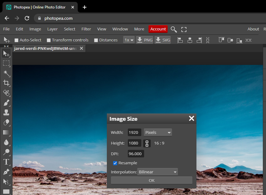 Go to photopea.com and open the image by going to File > Open (Choose your photo from the relevant folder).
Navigate to Image > Image Size (set the new dimensions and make sure that resample is checked). During resampling, the software will add new pixel information to prevent severe degradation in quality.
With vector-image formats such as SVG, modifying the file size has no effect on the image quality as the format is resolution-independent.
Learn how SVG compares to PNG.
Finally, if you’re a Mac user, you don’t even need any third-party app as you can use the pre-built Preview app to resize images without losing quality.
Similarly, if you’re a Microsoft fan, you can use one the native photos Windows apps to resize your photos, or download a free plugin like Bulk Image Resize from the Store with offers 3 different resampling options.
What Are the Best Apps for Resizing Images?
Many tools will allow you to resize and compress images. Selecting the best tool can be a bit hard. Well, meet Squoosh:
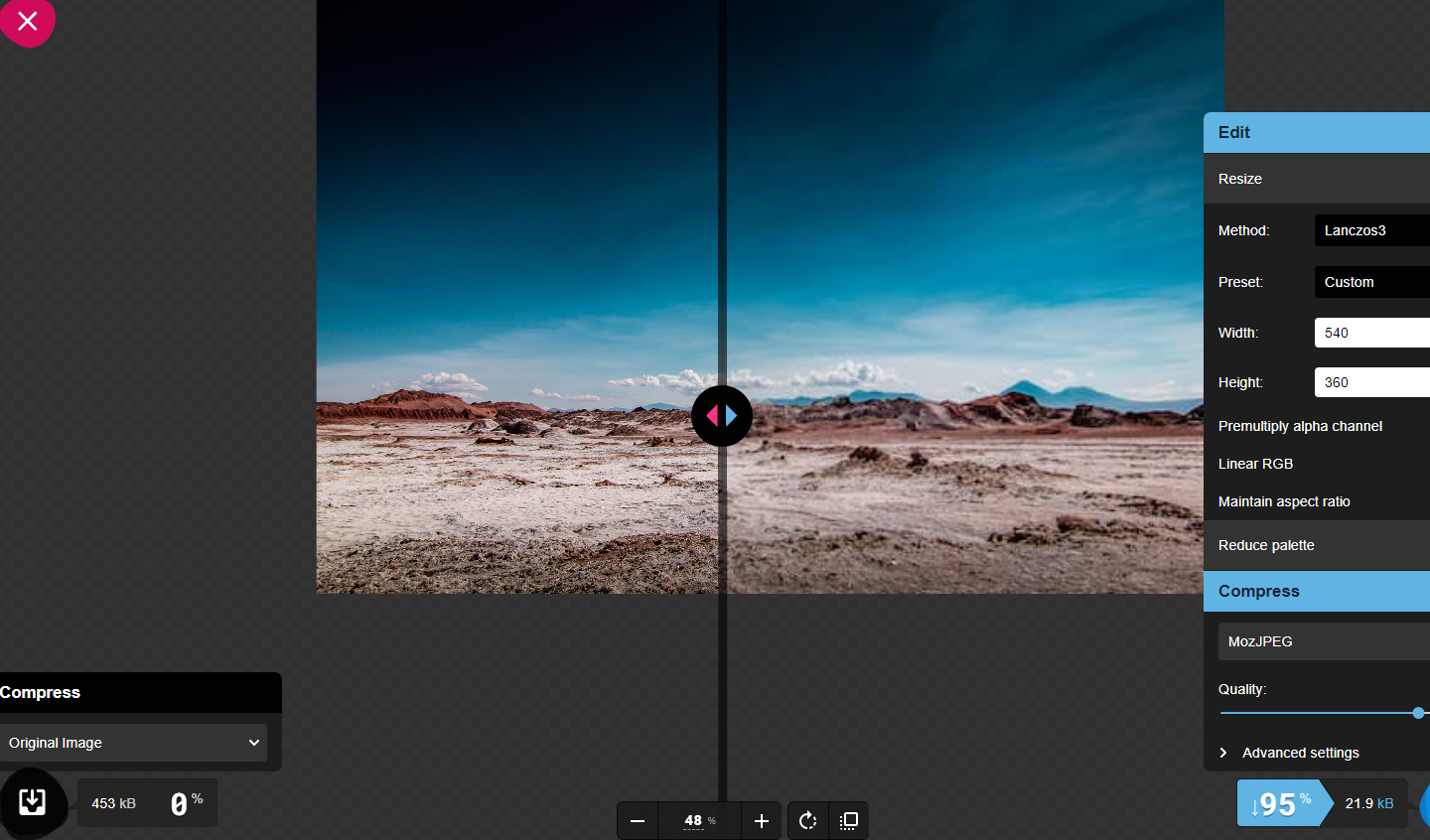 It resizes and compresses images at the same time. You can even convert the image to new generation formats such as Webp or MozJPEG. By dragging the slider, you can compare the before and after results.
On Windows 10, you can use Paint 3D.
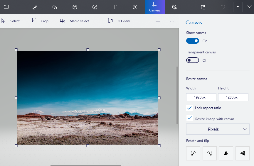 Just open your image, and choose Canvas from the top menu. Remember to keep copies of your original images as a backup.
Here are more tool recommendations:
- BatchPhoto – Available from the Mac App Store
- PhotoSize – Online tool
- ShortPixel – WordPress Plugin
- Smush – WordPress Plugin
- Image Resizer – Online tool
Keep in mind that these apps are mostly used on desktop. If you are using another device – for example if you need to resize an image on iphone – you’ll most likely need a more tailored approach.
What Is the Best Size for a Featured Image in WordPress?
The consensus about the best WordPress image dimensions for the featured image is 1200 x 628. It’s compatible with most themes. If the dimensions don’t work, check for the specific width of the featured image container using Developer tools or from the theme documentation. Additionally, you can make your featured WordPress image retina-ready by doubling its width to 2400 pixels wide. As we covered in another article, the size and quality of the image help optimize your WordPress featured image for SEO.
What Is the Perfect File Size for Images?
Large image files can significantly impact your page load time speeds. If two competing sites have similar content, Google now prioritizes the site that loads faster.
The standard advice is to make all image files less than 300 KB. It is still possible to compress images to smaller file sizes. You can use compression tools, use JPEG over PNG, or consider saving images in new generation formats like WebP. Remember, compressing images is an important part of your image SEO, so you should not neglect it.
Does WordPress Auto-Resize Images?
Yes, WordPress generates three image file sizes from an original image:
- Medium – 300 px width & height
- Large – 1024 px max width & height
- Thumbnail – 150 x 150 px
The images are used for different screen sizes. Some users have had issues with the generated images in the past because, at times, they can be blurry.
If you face this issue, make sure that you select the original image when inserting photos into your blog posts. The original image should be appropriately resized and compressed.
How Do I Automatically Resize and Compress Images in WordPress?
Resizing and compressing images before you upload them on WordPress can take a bit of time. You may want to have everything done for you by uploading the original pictures. Is this possible? Yes, you just have to look for a relevant plugin and install it for your WordPress site.
Some plugins that will automatically resize and compress images include:
- ShortPixel Image Optimizer (For compressing and converting images to next-gen formats): The plug-in optimizes and compresses all images in your media gallery. It also allows you to convert images into next-generation formats. You can perform bulk operations and save a lot of time.
- Resize Image After Upload (For resizing images)- The plugin is also provided by ShortPixel, and it will automatically resize images into defined dimensions for width and height.
- Better Images: The plugin takes the inbuilt resizing functions of WordPress to a new level. It generates more image size options from the same image and also compressors images to save on space. It also has other useful functions, such as removing special characters from the file name.
Tip: Source the Right Image Sizes to Avoid Unnecessary Resizing
If you use stock photography, you should consider choosing the right size to avoid the hassle of having to resize images again. Unsplash, Pexels, and Pixabay all provide three different sizes for the same file, along with the original photo. The smallest size is usually 640 pixels wide, medium 1280 px, and large 1920 px. If you use our free image suggestion Google Docs Add-On, you can choose the file size you want to insert into the document